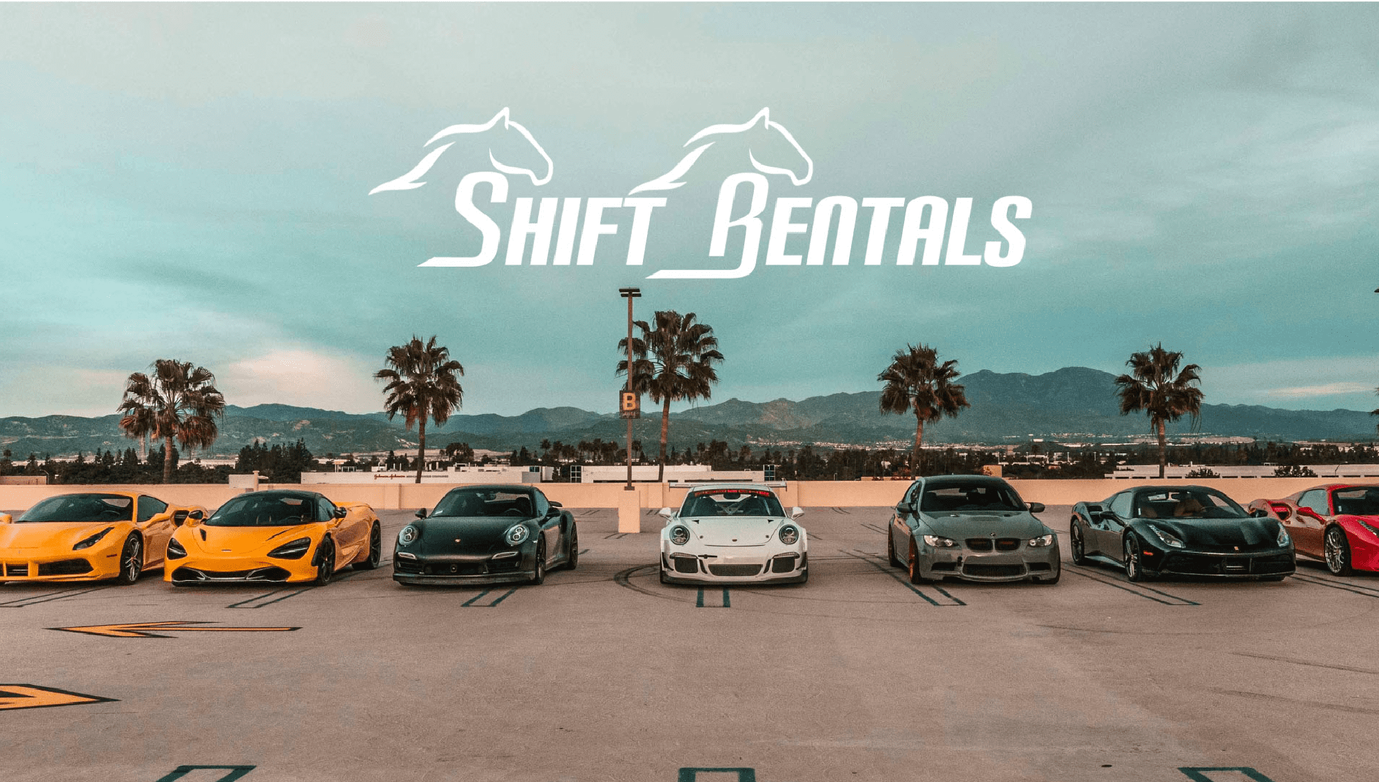
Shift Rentals
Elegance in power.
The service inspires speed, luxury, and power. However, the brand did not. We needed a symbol that gave the same energy, and separated the brand from the hundreds in the market using the generic identity of a logo with a swirl over a sports car silhouette.
They received the best symbol of power, elegance, speed and luxury. I never tell a client a logo will make or break the company because its simply not true, but this is the most impact I have ever seen from a brand we made. The entire business is being propelled in such an effective manner they have organically been able to exceed 70k followers and have become one of the most recognized car rental brands next to MPH club in miami. I have no doubt this company can exceed all expectations.

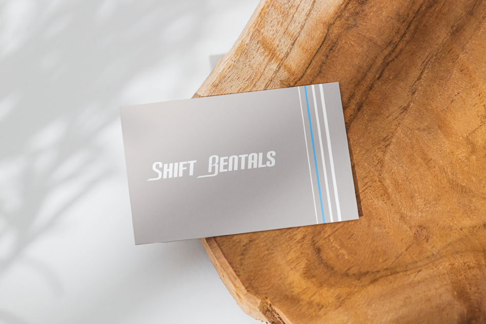
The color palette used in this brand is bright light blue, black, and light grey accompanied by small amounts of white either as a stripe, lettering, or the logo itself. The Identity is always showcasing the two horses in movement in all its formats with the letters resembling the legs and body of the horses.
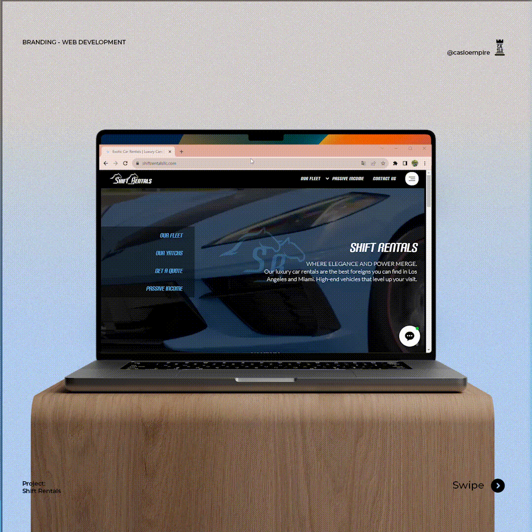
Website design
Lorem ipsum dolor sit amet, consectetuer adipiscing elit, sed diam nonummy nibh euismod tincidunt ut laoreet dolore
Lorem ipsum dolor sit amet, consectetuer adipiscing elit,
Lorem ipsum dolor sit amet, consectetuer adipiscing elit, sed diam nonummy nibh euismod tincidunt
Final Mockups

Optional